


identity, range design
Strict recipes have been replaced by
casual banter. Waitrose Cooks’ ongoing dialogue
captures this new spontaneity.
What better way to bond with the brand?
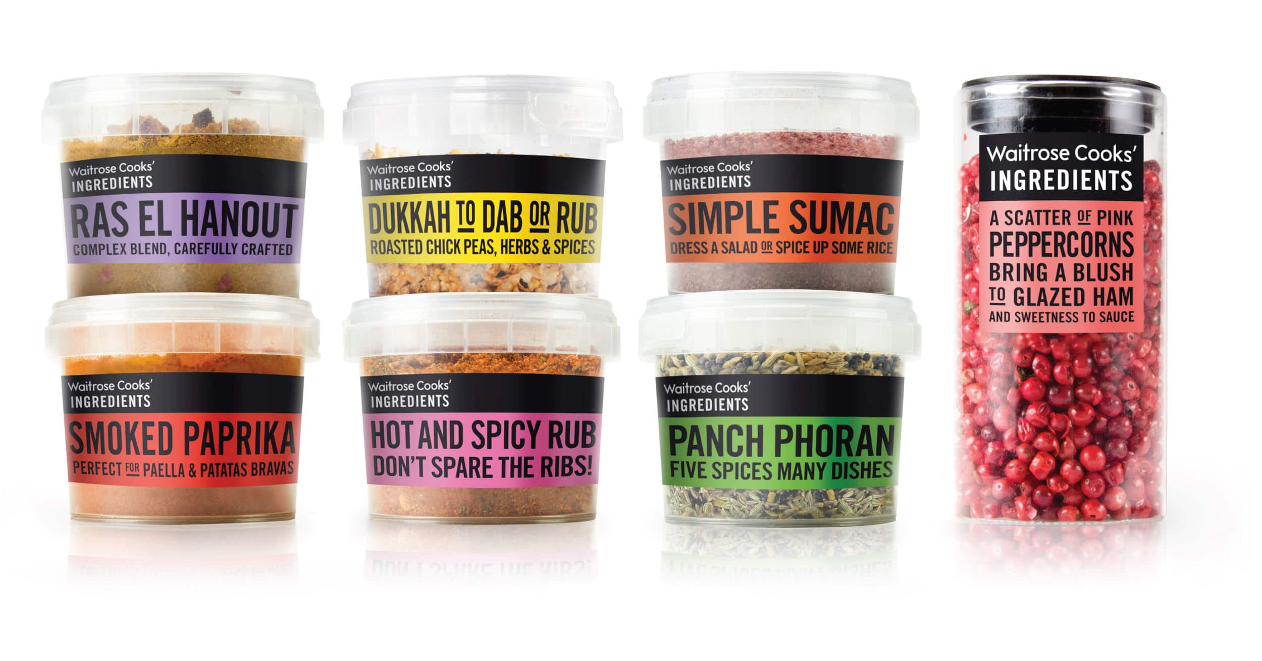
WAITROSE COOKS’ INGREDIENTS
CHALLENGE
With the proliferation of celebrity chefs and food editorial, we have become increasingly interested in a culinary world.
SOLUTION
Waitrose has responded with a range which satisfies the enthusiasts’ everyday needs.
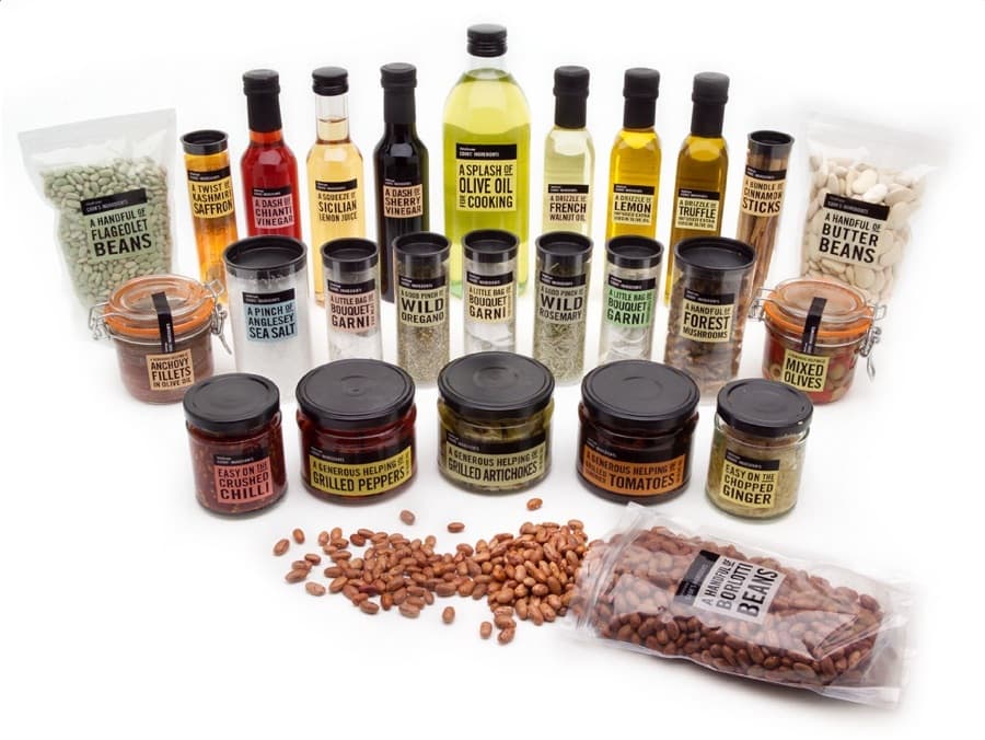
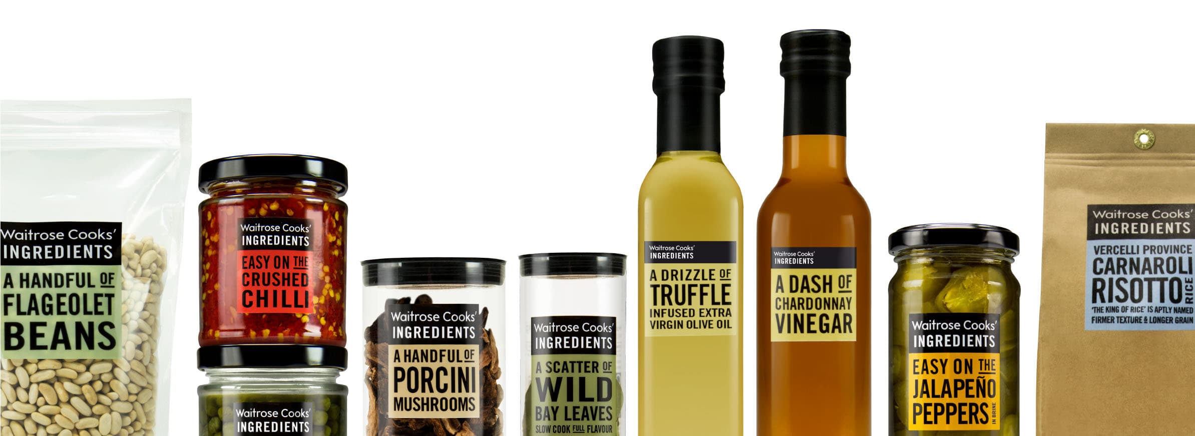
Lemon juice is sourced from Sicily, sea salt
from Anglesey and walnut oil from France;
not your average “cupboard basics”. And,
as any foodie worth their salt will tell you, even the most modest dishes require the
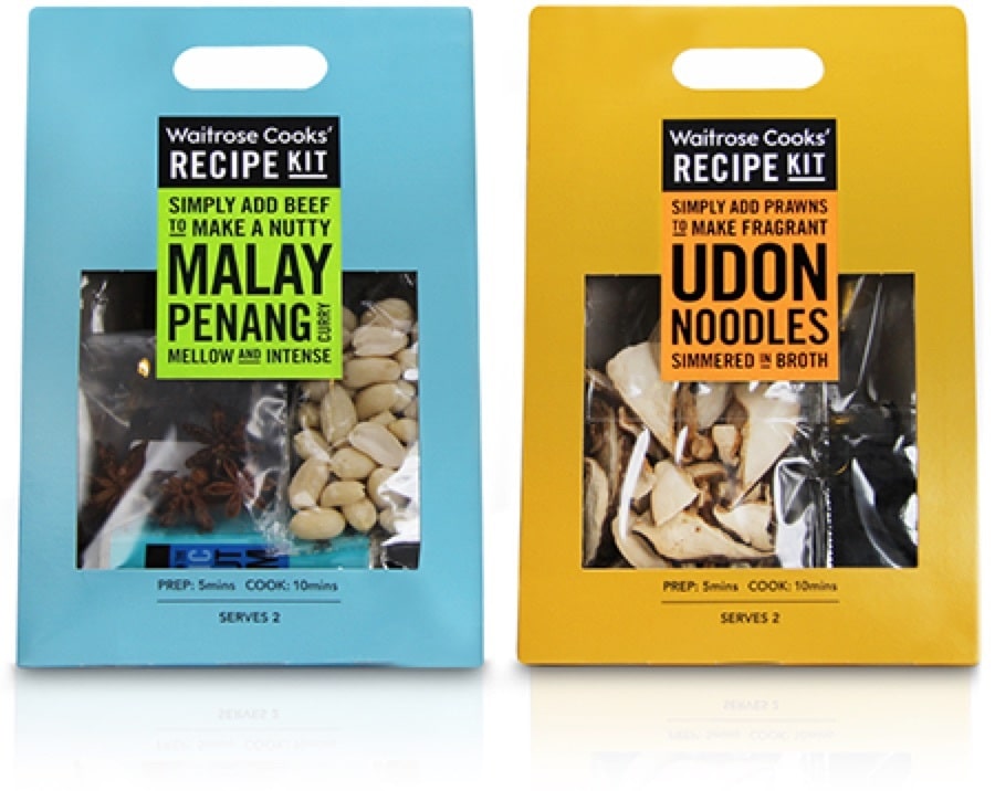
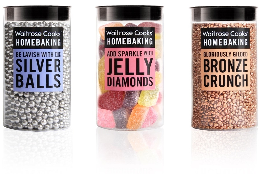
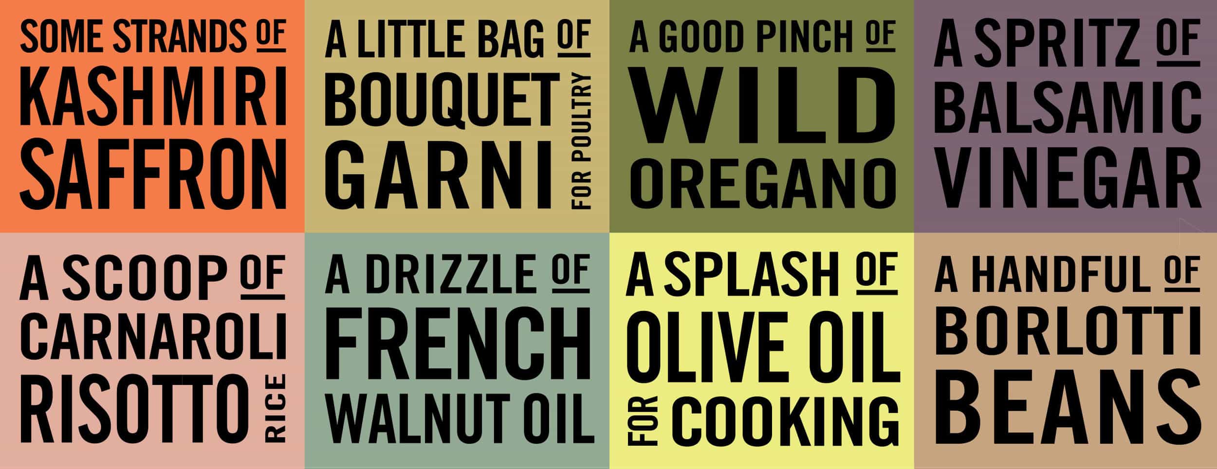
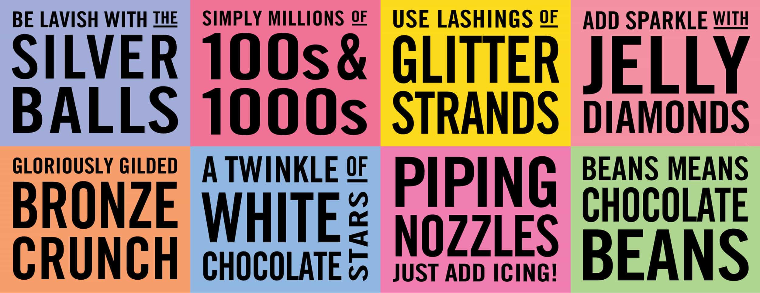
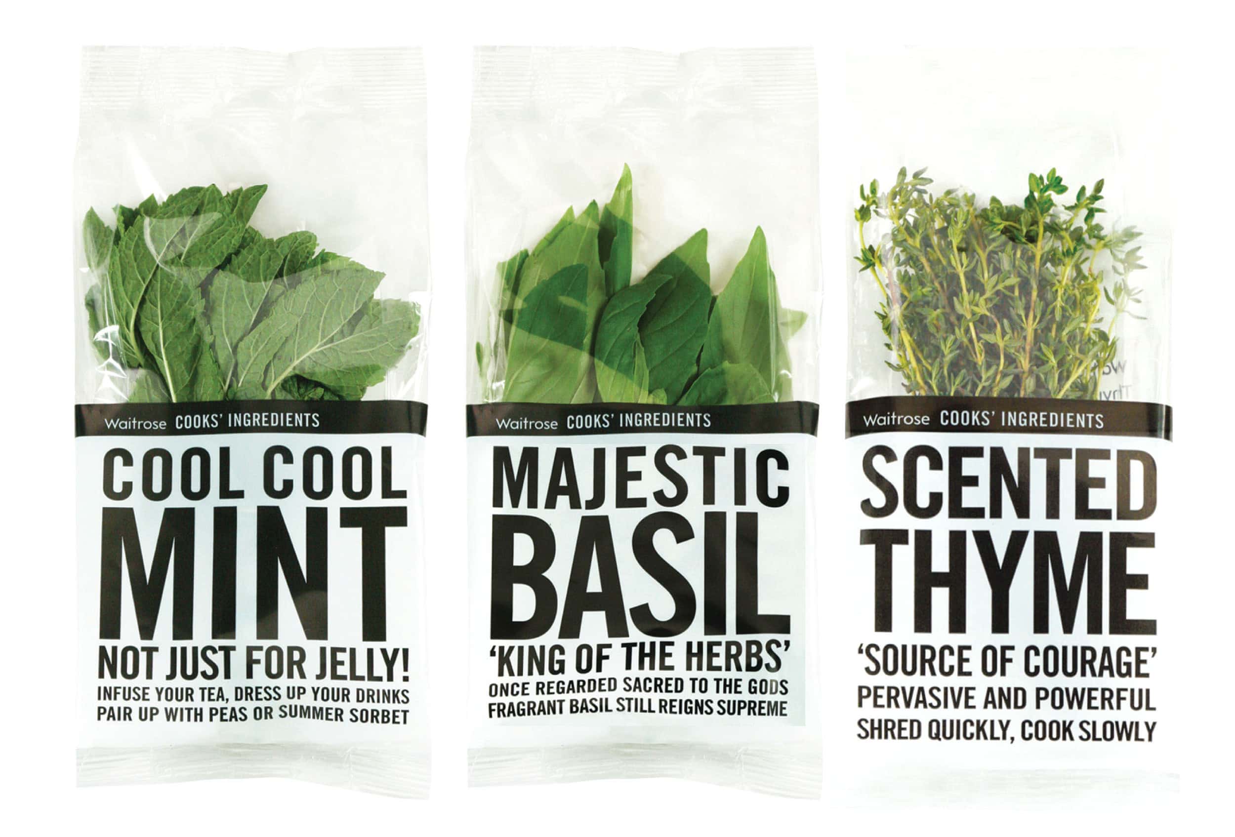
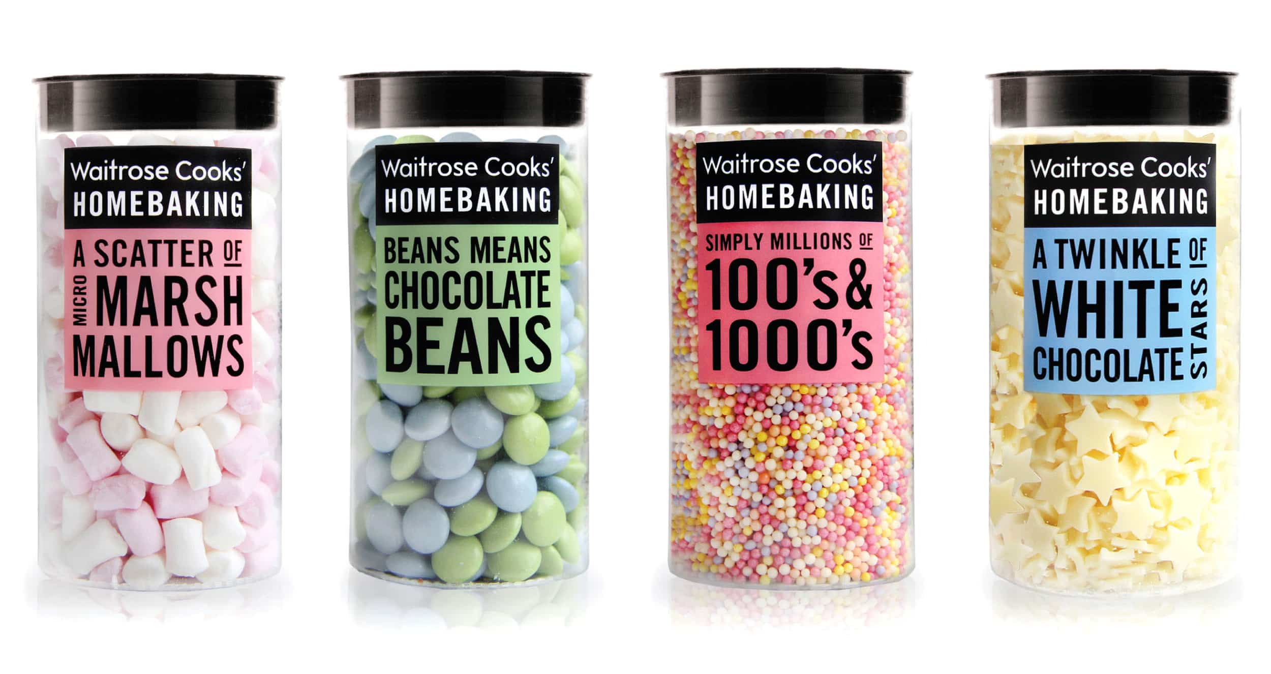
right ingredients, sourced selectively. We have designed labels, identity and packaging for Cook‘s Ingredients, Homebaking, Fresh herbs and Recipe Kits. Each one introduces its contents with an energetic no-need-to-measure-it phrase:
“A good pinch of wild myrtle” sits alongside “Easy on the chopped chilli”. Subtle use of colour and an engaging tone create an interactive and collectible range. Numerous accolades include three Design Business Association Design Effectiveness Awards.
Create a dialogue…
WINNER PENTAWARDS 10th ANNIVERSARY AWARDS, BEST OWN BRAND IN LAST TEN YEARS
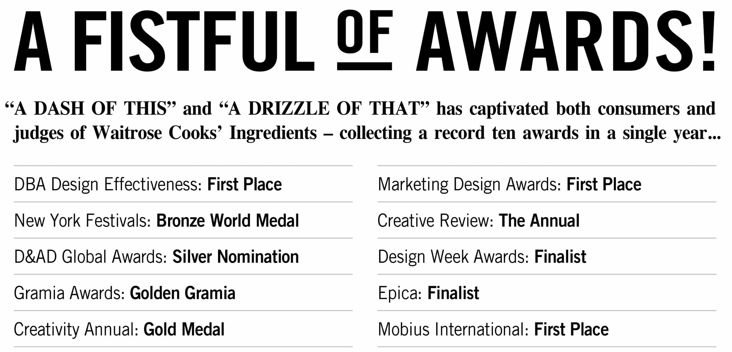
In the 10 months since launch, Waitrose Cooks’ Ingredients achieved average weekly sales that are an astonishing 43% above target. Several products have been duplicated and the incremental sales from these range from between 30% and almost 100%
“We were absolutely delighted with the design,
which successfully brought together a large range
of products into one focused proposition.”
“Cooks’ Ingredients is oozing with
quality and engages with the customer.
The results speak for themselves.”