corporate identity, brand creation
Historic iconic landmarks speak for themselves.
Branding must integrate and modernise,
with a respectful nod to the past.
ST PANCRAS
INTERNATIONAL
CHALLENGE
Historic, iconic landmarks speak for
themselves. Branding must integrate and modernise, with a respectful nod to the past.
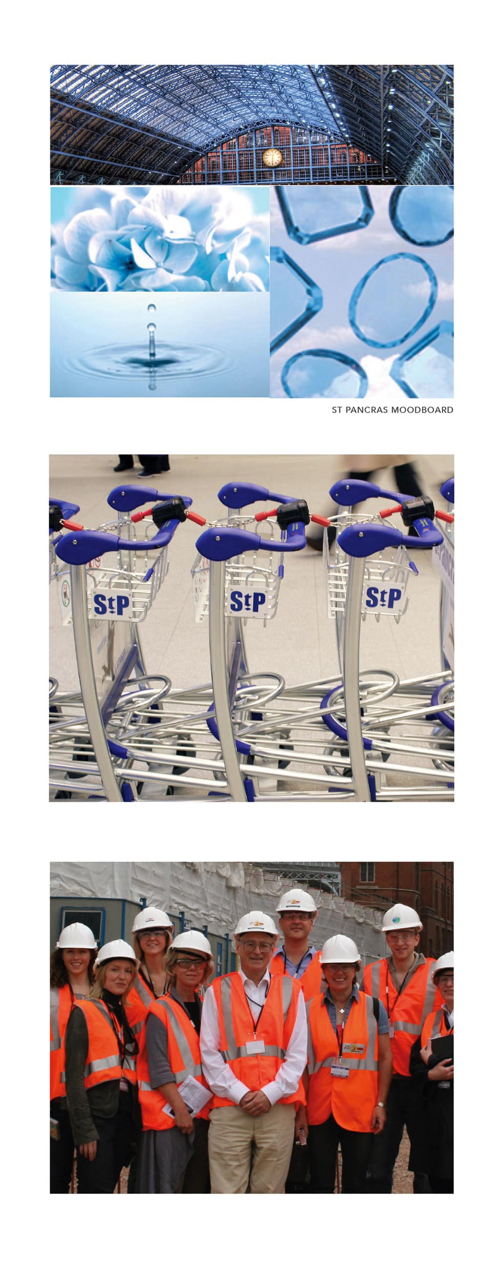
St Pancras is a heady mix of old and new, with the glittering glass arch nestling alongside the original, magnificent façade.
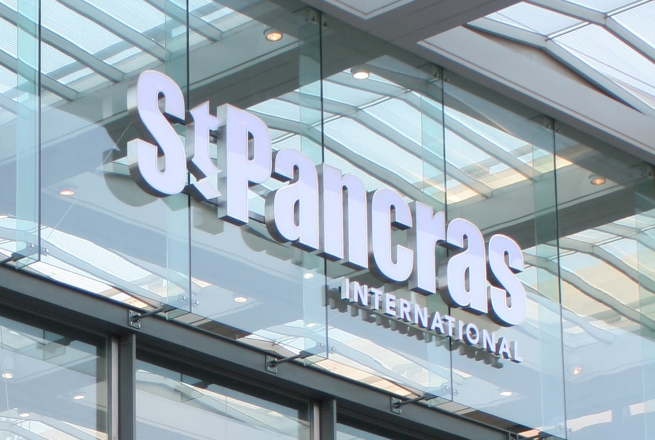
A dramatically visual experience required a simple, respectful logo.
SOLUTION
Clean, bold lettering features a gothic ‘t’
and detail diamond, which echoes the diamonds on the original station clock.
The sky-blue palette features Barlow Blue, named after William Barlow. It was intended to “blend with the heavens” and make
St Pancras appear “open to the universe”. Appropriate aspirations for a station restaged as a destination brand.
LM branded Europe’s longest champagne bar which runs parallel to the tracks, alongside a brasserie, gastropub, farmers’ market and numerous meeting points. Hence the
rallying cry “Meet me at StP”.


