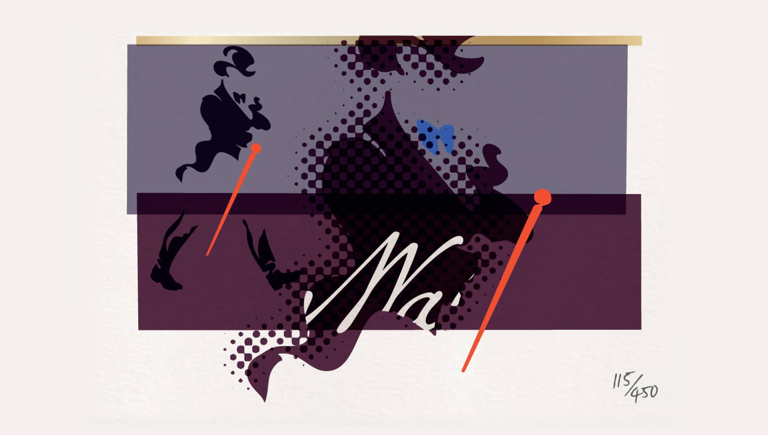
brand redesign, portfolio design
JOHNNIE WALKER DIRECTORS’ BLEND
Confident brands play with their codes.
Enter Johnnie Walker, layered eclectically through
a limited edition series of screen prints.
Each tells a story of a walk through time…
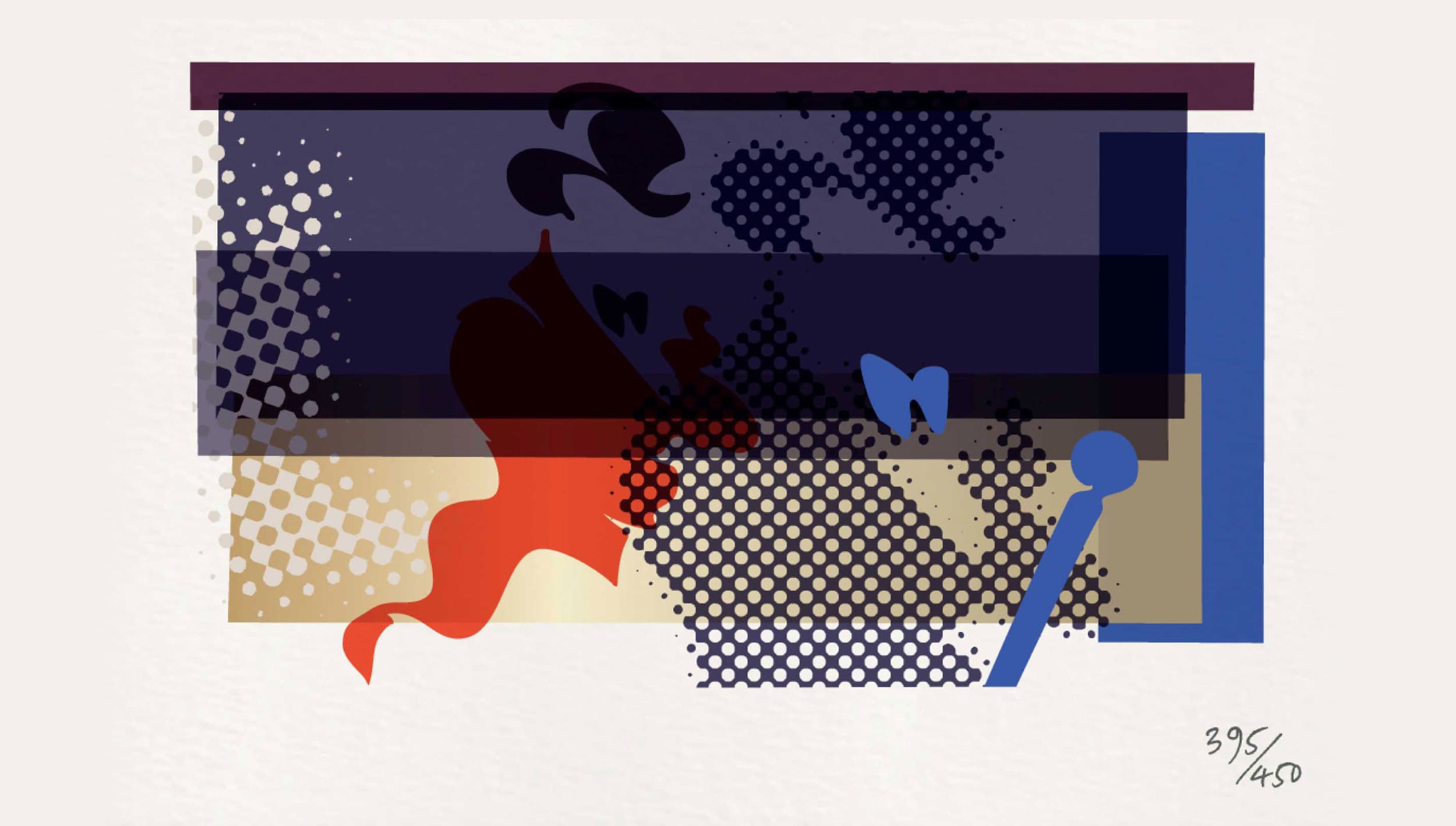
JOHNNIE WALKER ICON
Contemporary brands cross borders and connect cultures.
We filled the world’s most famous silhouette with
symbolic imagery, touching a chord, showing respect
and winning
local hearts…
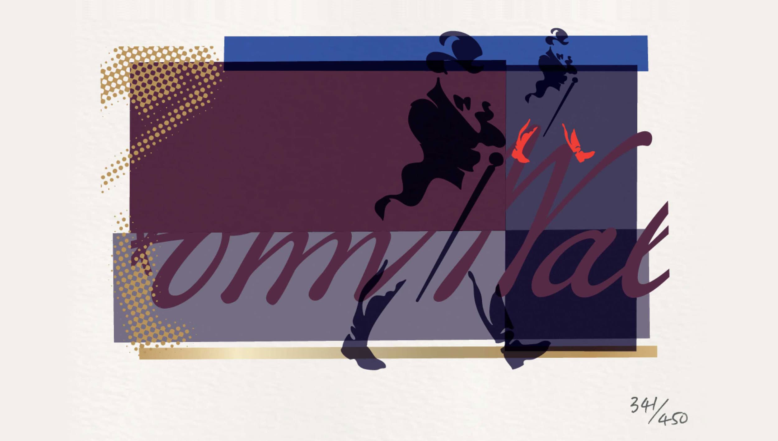
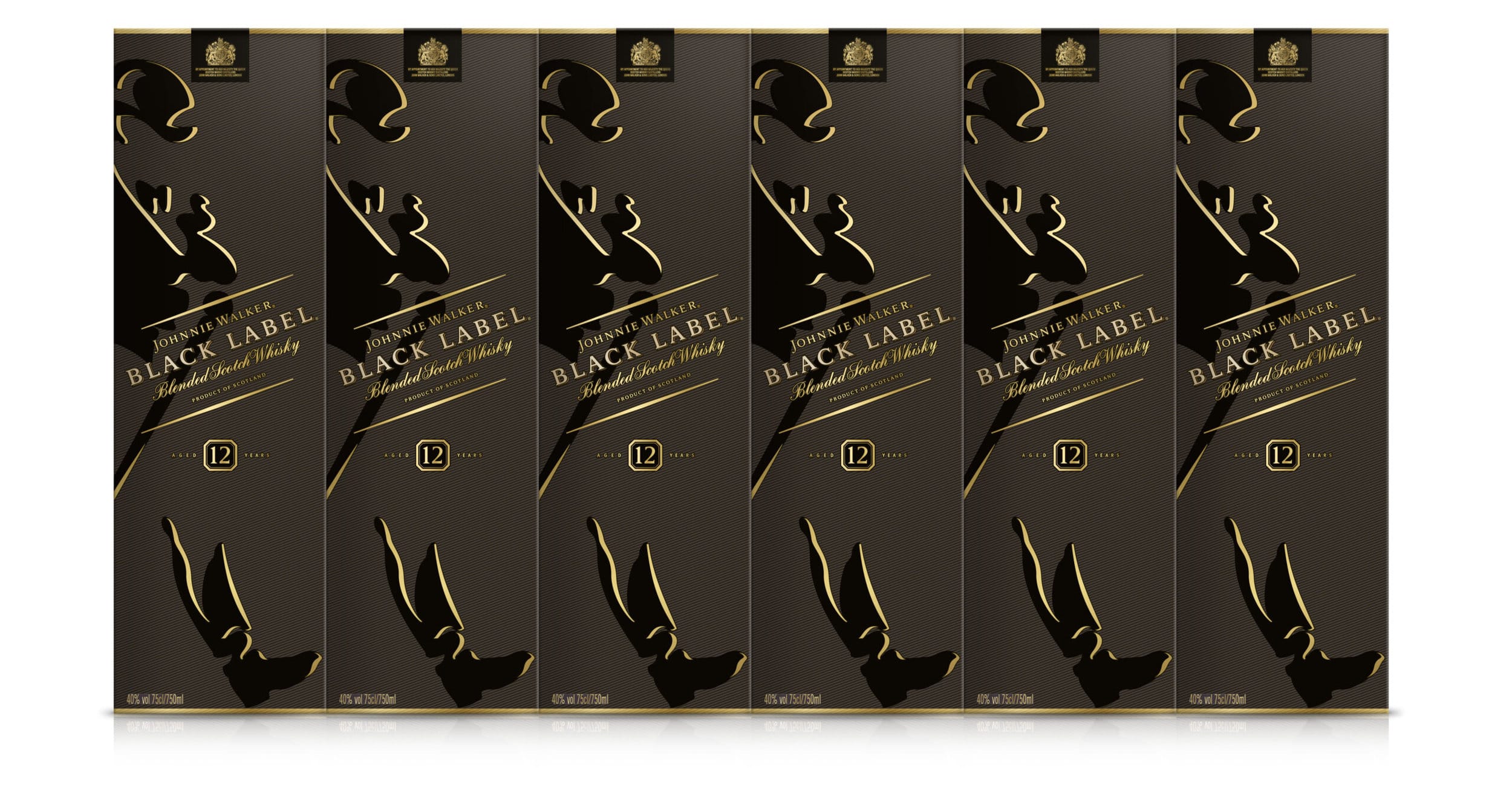
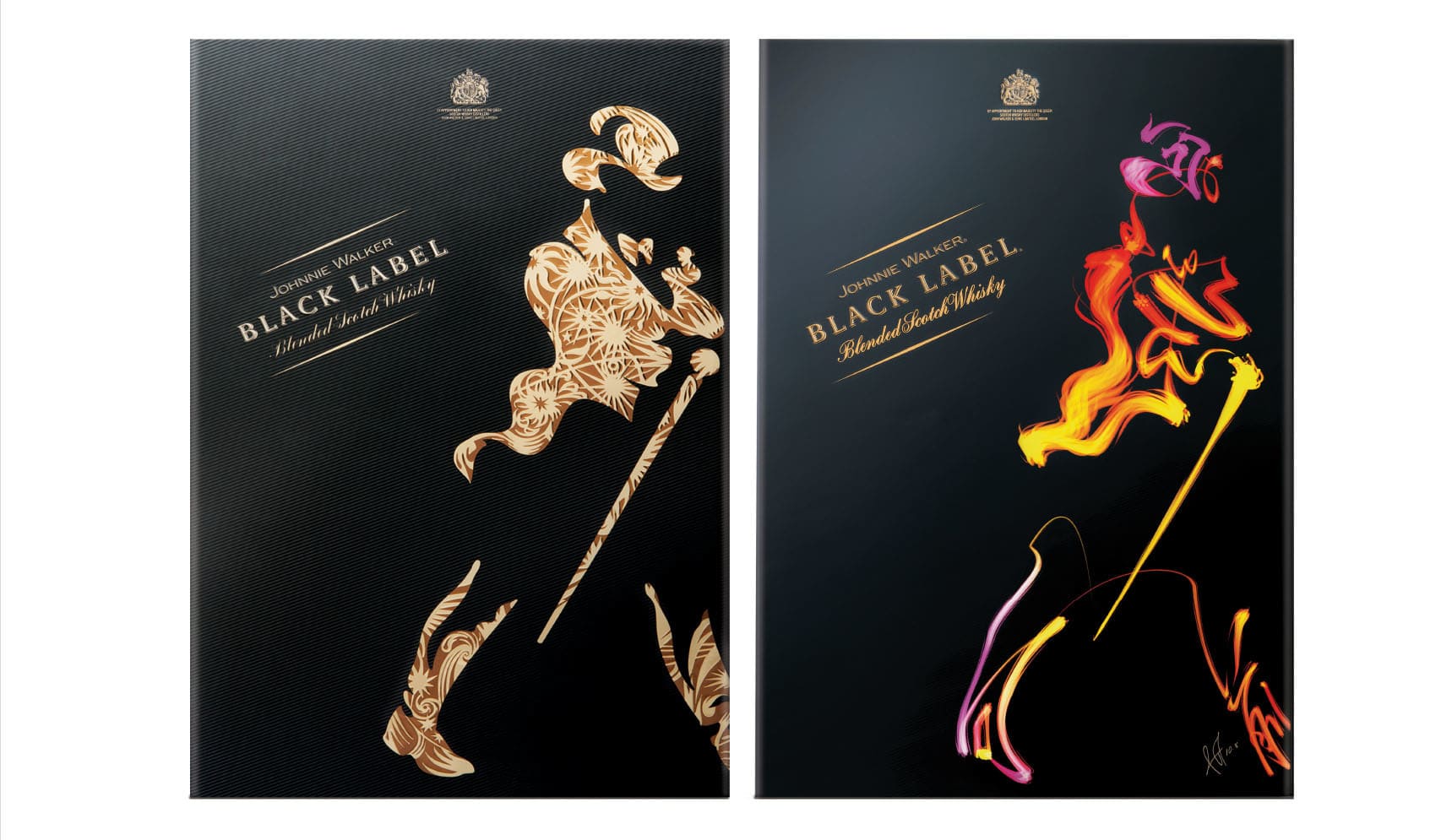
JOHNNIE WALKER GIFT PACKAGING
CHALLENGE
Gifting is important within Vietnamese culture and particularly so at Têt, their New Year celebration. Vietnam is a ‘dark market’, no alcohol advertising is allowed and brands are highly dependent on good distribution and product displays.
SOLUTION
The gift packaging design dramatises
the iconic ‘Striding Man’ – making him hero. Full size, he confidently walks across the packaging face, his highly recognised shape in-filled with an exuberant and decorative pattern of fireworks, symbol of New Year celebrations.
In China, vivid colours from the artist Pan Jian Feng bring the icon vibrantly to life. Dramatising the ‘Striding Man’ has helped drive brand awareness and build visual equity through the rest of the year.
Johnnie Walker displays accounted for more than half the total category.
“Khong Ngung Buoc Toil” (Keep Walking !)
WINNER DESIGN EFFECTIVENESS GOLD
“It’s a brilliant combination providing local appeal while also building global brand credentials. The design delivers against our vision that deeply understanding and delivering against the needs of consumers in Asia will raise the quality of our design output. This design is now being used in multiple markets around the world and has been the inspiration behind a new direction for Johnnie Walker design.”
Jeremy Lindley, Global Design Director, Diageo
“This design is now being used in
multiple markets around the world and
has been the inspiration behind a new
direction for Johnnie Walker design.”
Jeremy Lindley,
Global Design Director, Diageo
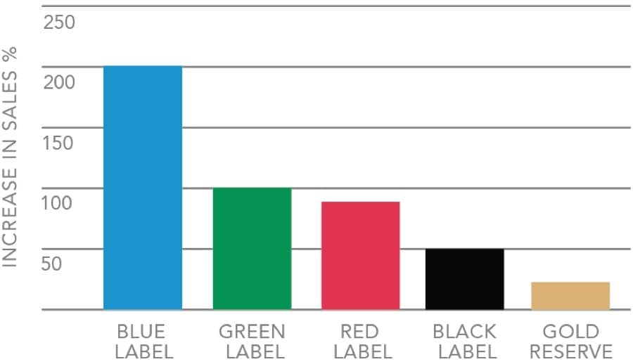
Sales increased by 63% year on year
with a net sales value of over £8 million.


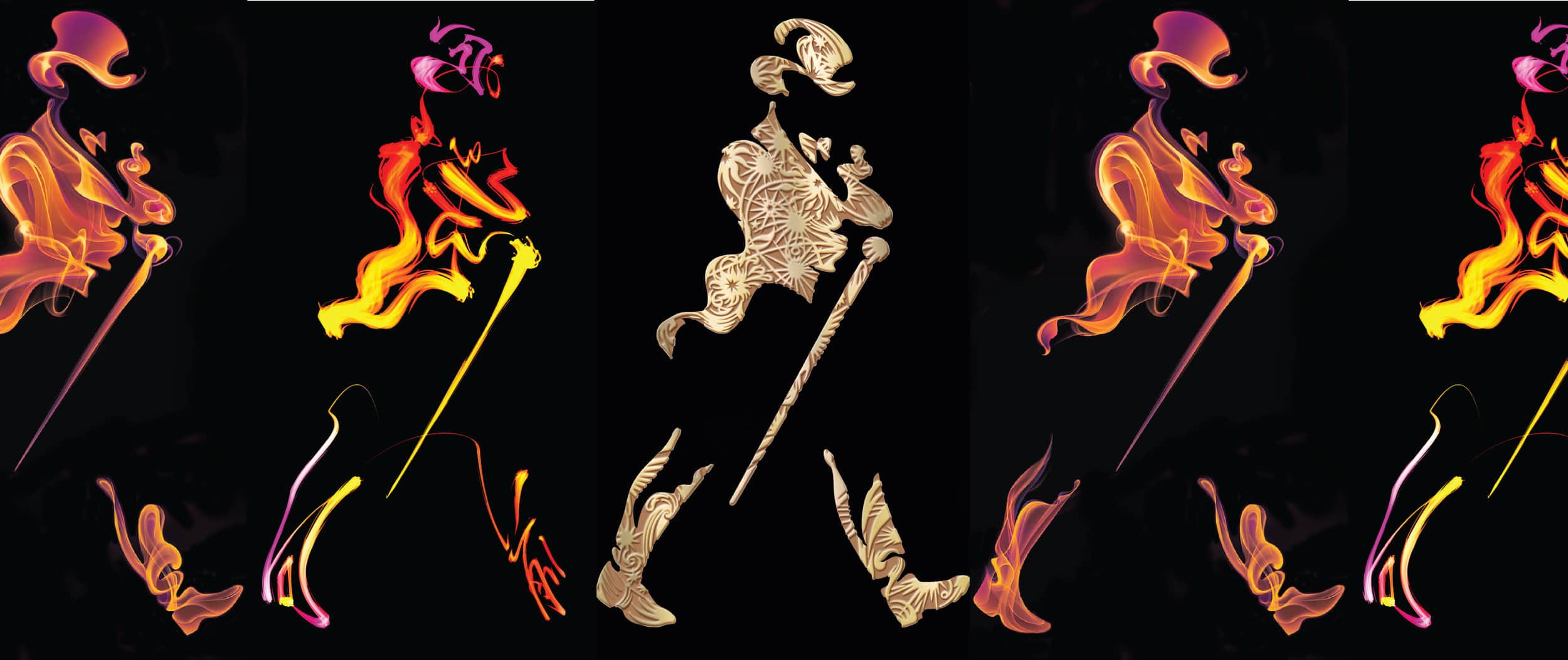
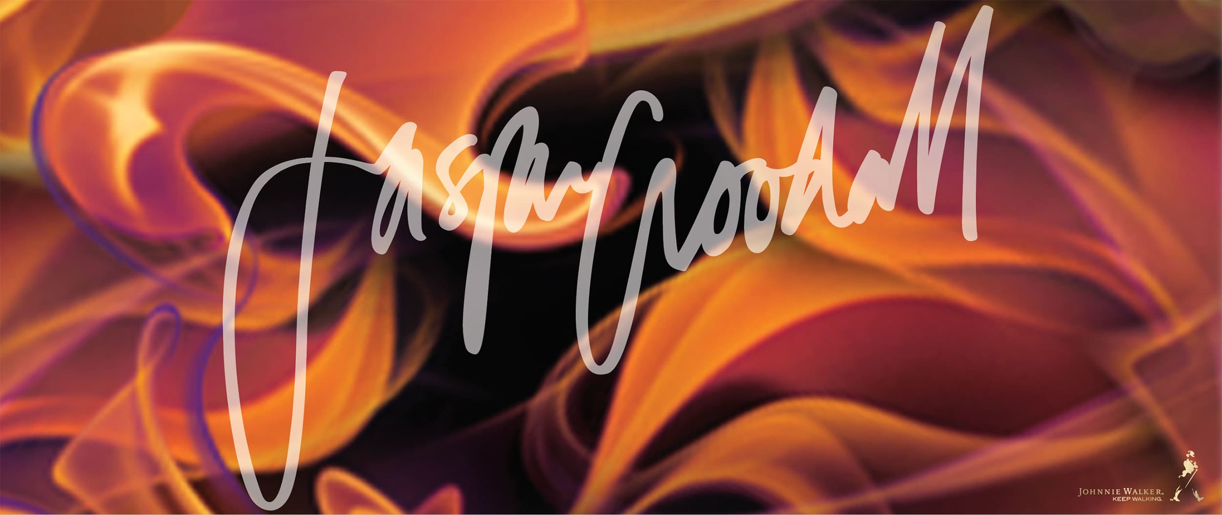
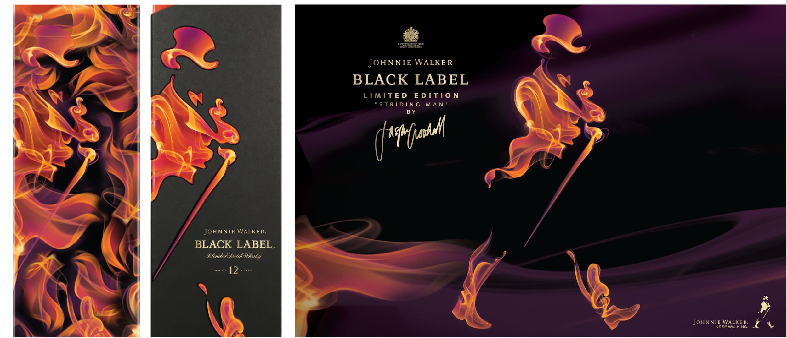
JOHNNIE WALKER JASPER GOODALL
Collaboration is at the heart of good branding.
It can connect, inspire and elevate.
Jasper Goodall’s smoky, ethereal imagery
fuses engagingly with the famous icon.
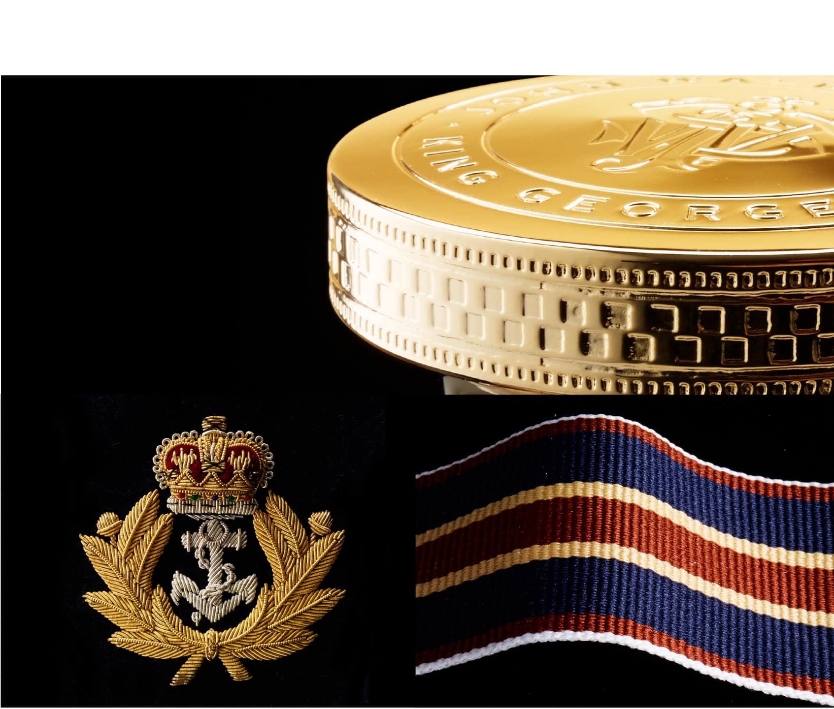
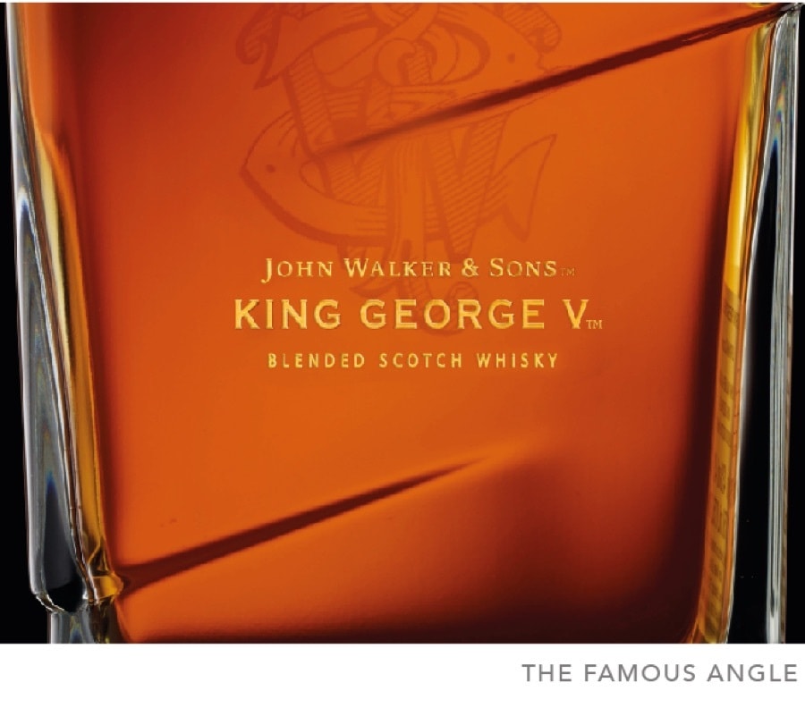
JOHN WALKER AND SONS KING GEORGE V
God is in the detail. A sumptuous presentation for
John Walker & Sons King George V holds a precious bottle, lifted carefully
from its mould by a heavy ribbon, reflecting the fine colours of the
naval heritage. The 18th century typography nods
to John Walker receiving the first
Royal Warrant.
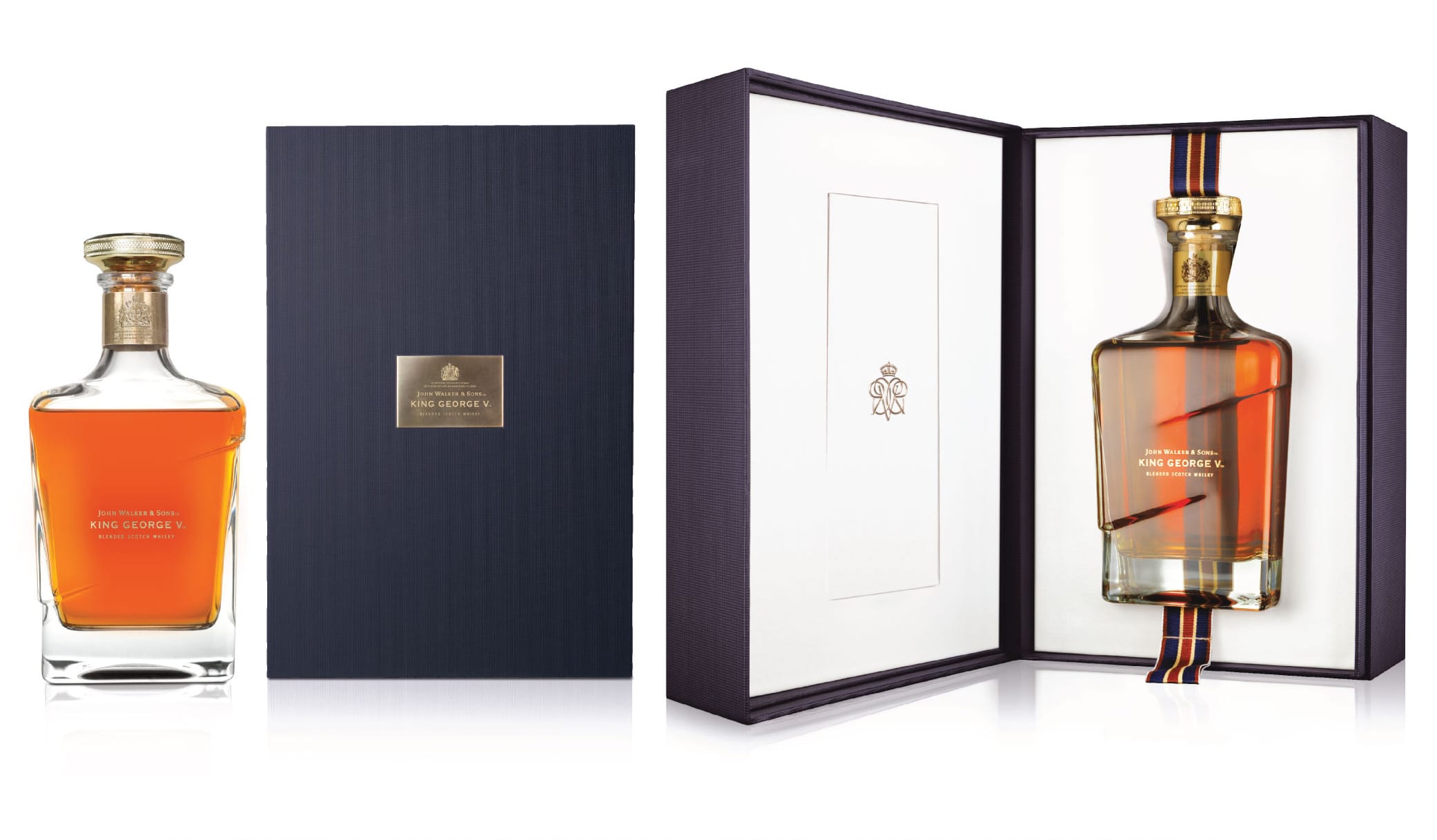
JOHN WALKER & SONS
KING GEORGE V
CHALLENGE
To elevate the brand, raise the premium
and rebrand Johnnie Walker Blue Label
as King George V.
SOLUTION
King George V awarded the first Royal Warrant to John Walker & Sons in 1937.
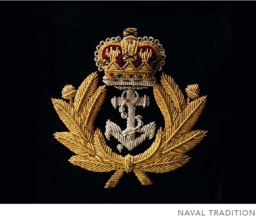
New luxurious packaging combines heritage underpinned by contemporary sophistication and craftsmanship. The design references John Walker’s service in the Royal Navy.
A gunmetal cloth finish box, braided ribbon and rich colours reflect naval tradition and underscore authenticity.
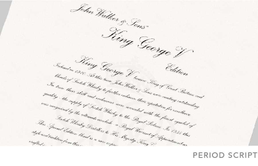
Typography reflects the period with a precious manuscript to discover and treasure. The opening ritual is generous and tactile, everything has its place and purpose.
Long live the king…


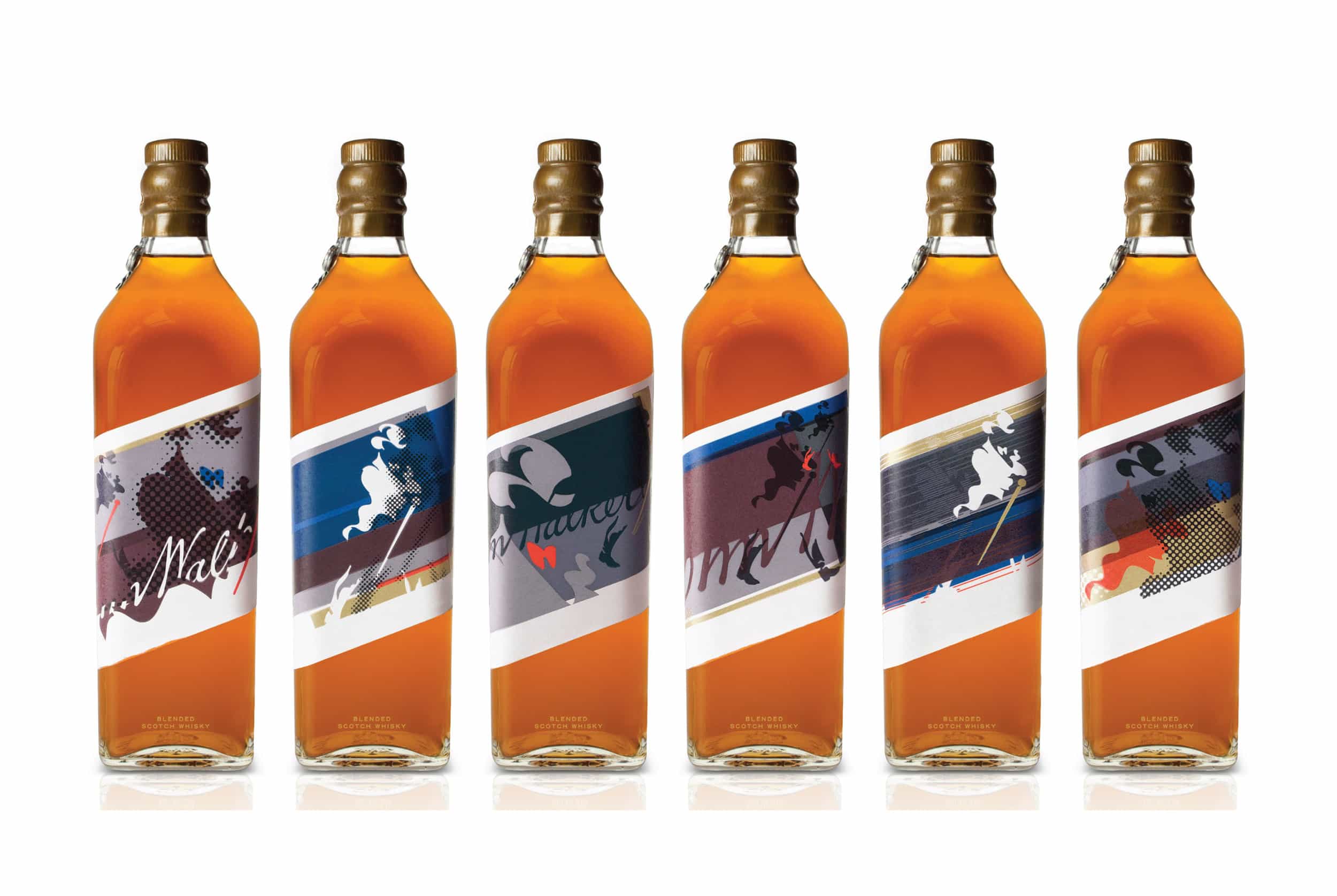
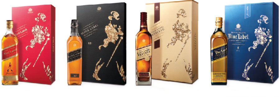
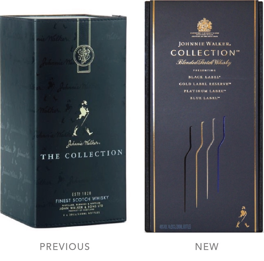
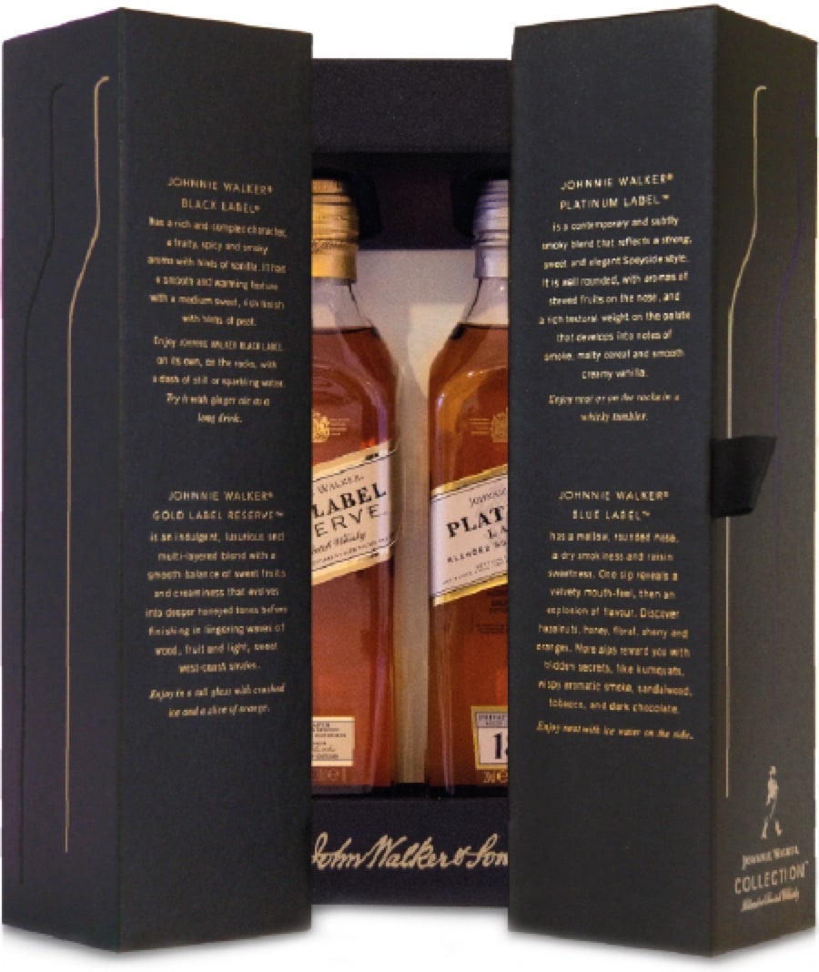
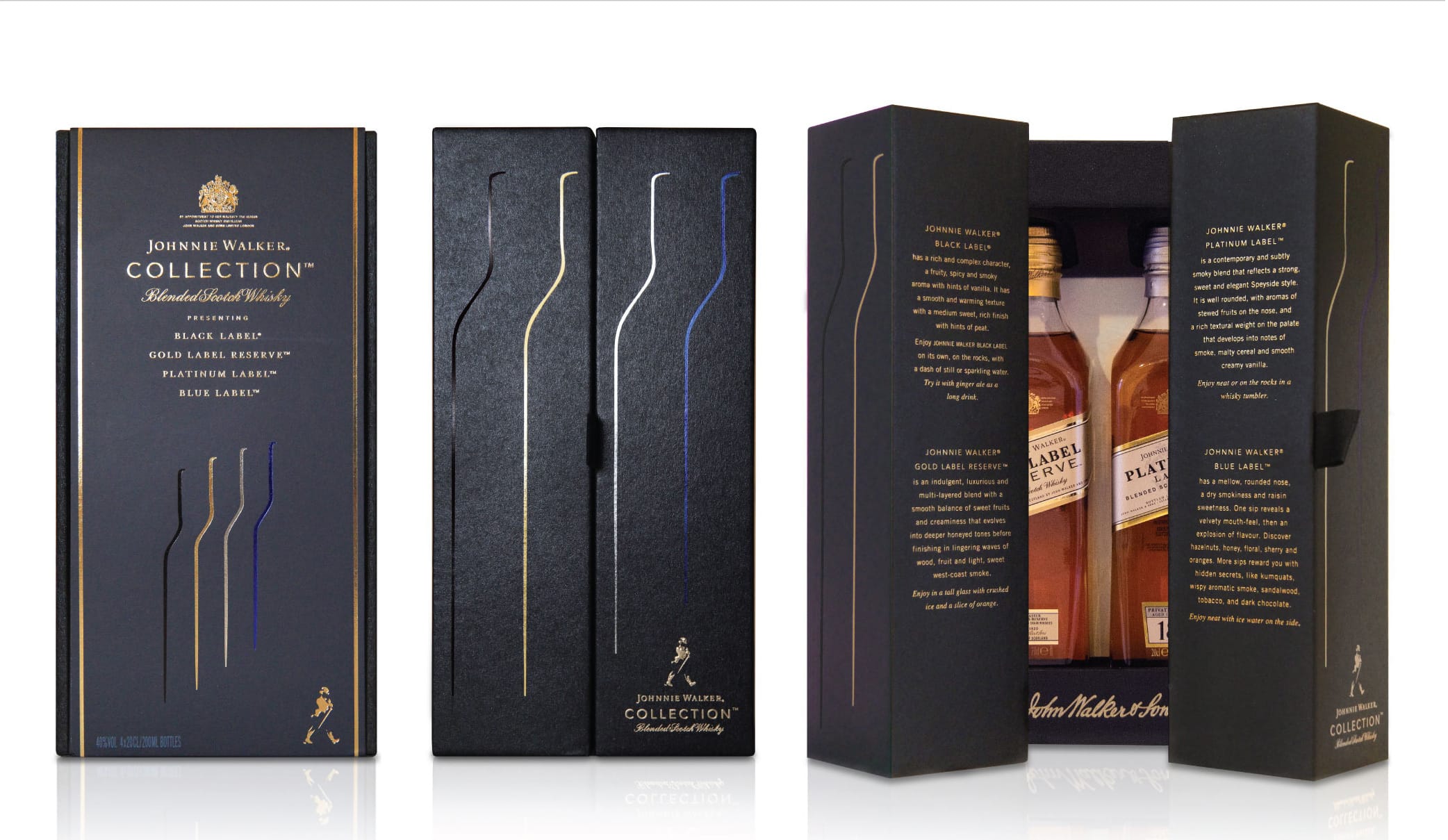
JOHNNIE WALKER COLLECTION
Duty Free is a battleground of brands, fighting for
space and a voice. Each has its own story to tell. This one is of
four famous blends, The Johnnie Walker Collection. Our challenge,
was how to balance ritual and information with panache and allure.
JOHNNIE WALKER COLLECTION
CHALLENGE
Global Travel Retail is a battleground, but provides significant incremental sales when the offer is right. The consumer mindset and increasingly luxurious surroundings enable brands to showcase premium products in
impeccable packaging.
The challenge was to elevate perception
of Johnnie Walker Collection, which contains four 20cl bottles, each of a different signature blend, Black, Gold, Platinum and super premium Blue. To make visual reference to the four blends within without revealing the bottles, was a key driver in the design solution.
SOLUTION
We created a compact and sturdy box, perfect for display whether shut or open. Four sleek slender foils in the famous colours nod to the bottle profile, gleaming with promise. Pace and ritual are introduced in the opening. Tasting notes evocatively describe each blend.
To have and to hold…
WINNER DESIGN EFFECTIVENESS GOLD
BEST TRAVEL RETAIL
“The new design with its attention to every detail, beautiful materials and finishes has transformed Johnnie Walker Collection into a highly desirable gift pack with great
displayability. The commercial results speak to the success of the redesign.”
Clare Negus, Design Leader, Diageo

“I would advise using Lewis Moberly, they have
done the best work on Johnnie Walker recently and have
extensive expertise in a lot of product categories.”
“This is just to say thank you for an amazing job.
The design looks awesome, a real game changer”