identity design, packaging design
Stylish brand or style brand?
The key to Selfridges’ success is the former,
never losing sight of an extraordinary past,
and having the confidence to mix it with the new.
SELFRIDGES
CHALLENGE
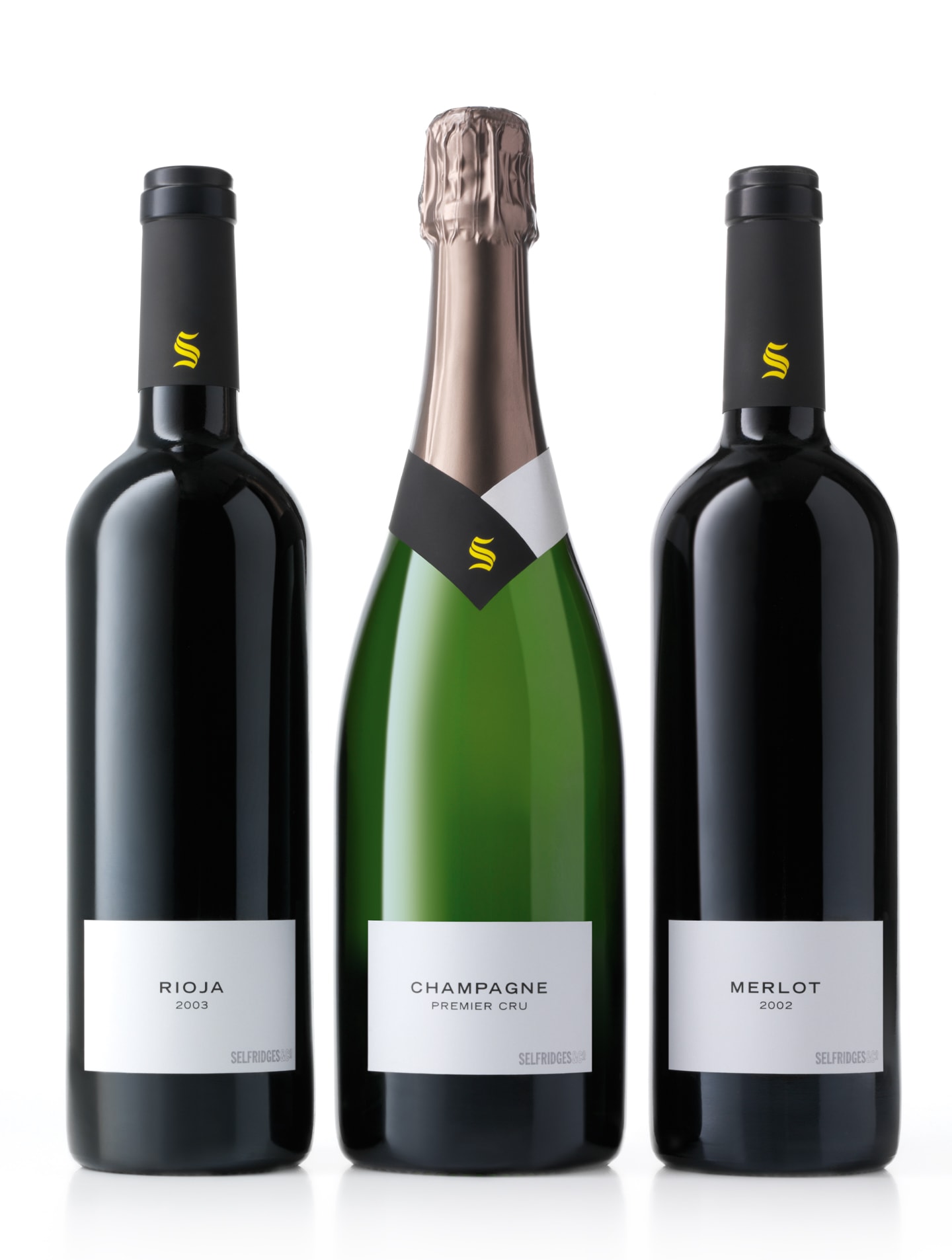
Historically Selfridges Food Hall had been a destination for food lovers, but was less well associated with the brand than fashion and beauty. This project brings flair to food, reflecting Selfridges’ core values: extraordinary, inspiring and captivating.
The design task was to create a strong brand identity and unify a diverse range of
packaging structures.
SOLUTION
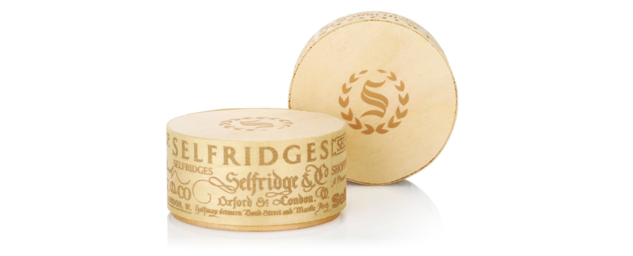
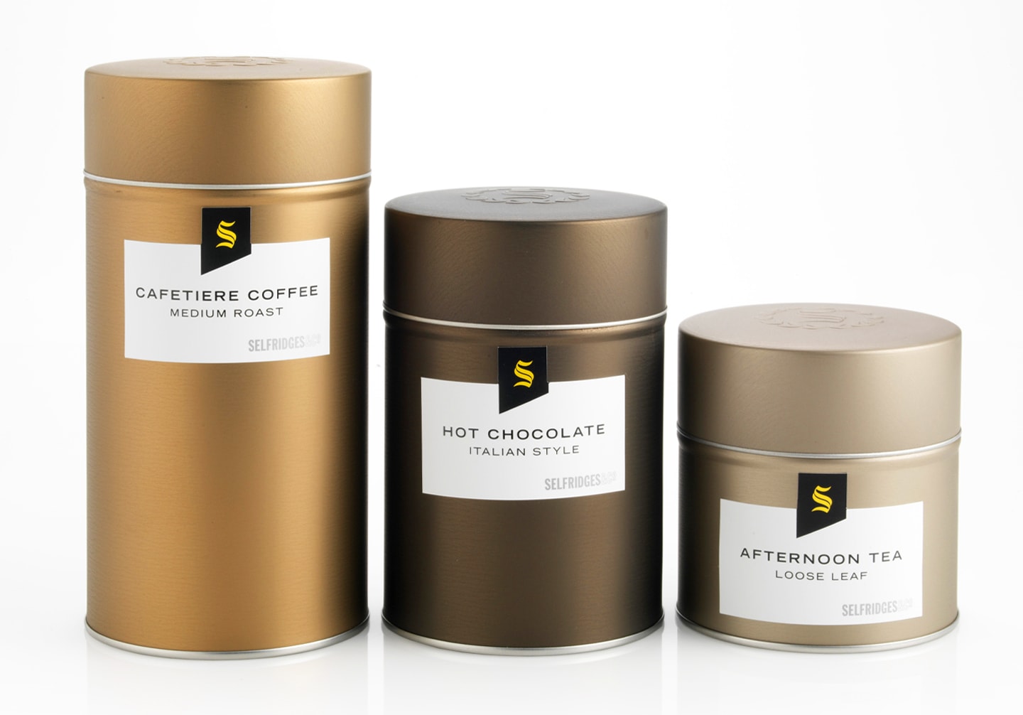
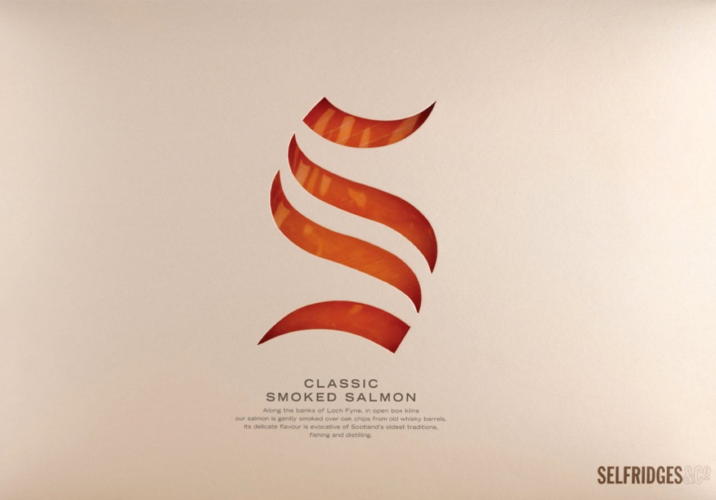
Selfridges impressive history has inspired
an adventurous brand. Our design ensures Selfridges’ food credentials are foremost, avoiding uniformity and creating a lively, surprising and collectable range.
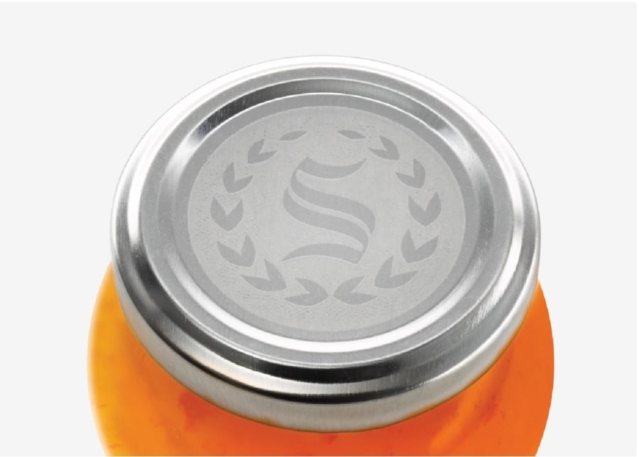
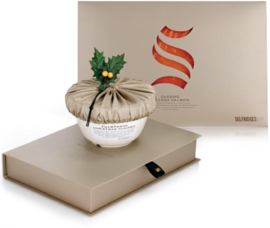
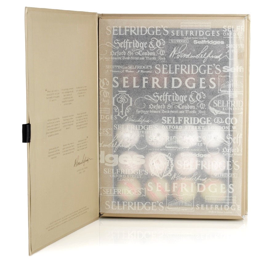
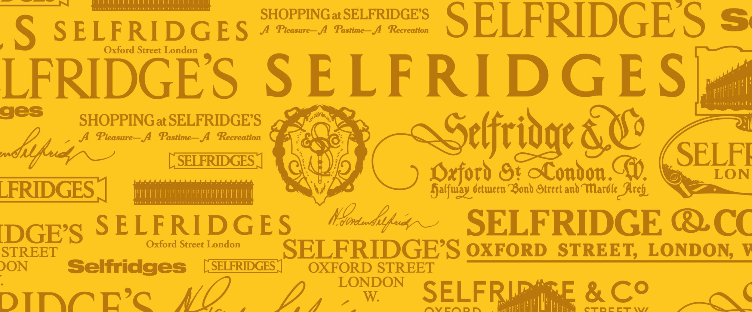
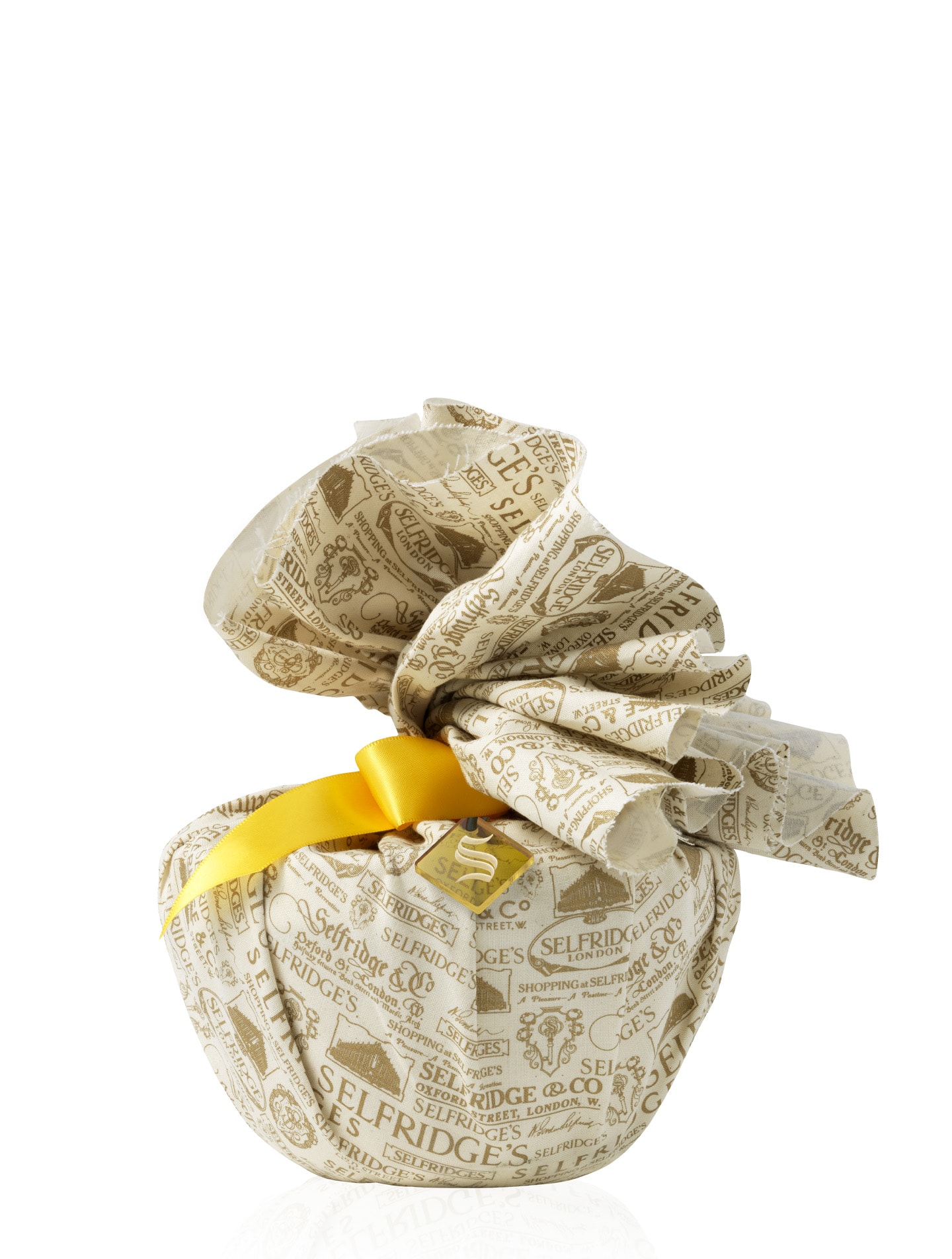
A signature ‘S’ found in the archives unifies the range, and is presented in a contemporary, eclectic and tactile way. Minimal labels and splashes of bright yellow are tempered with silver, black and bronze. Products are celebrated as hero. Packaging cues nod to other categories: truffles nestle in a book, complete with Gordon Selfridge anecdotes on the inside cover. Yellow holly berries come out for Christmas, paying homage to the brand‘s famous colour. You are what you wear…